I’ve been meaning to do this for about 100 years…where years equals maybe days.
Anyway, I’ve never found a very helpful reference that actually shows you what each style element in a pivot table formats. I tried to write something up which would explain each piece, but I found it pretty hard to explain, since there are so many potential uses for pivot tables and so many types of data you might want to use them to analyze.
So, instead, I created a little workbook doohickey which will allow you to fuss with a pivot table to see all the different options and combinations – complete with a color coded key so that you can see what each one does! First, a tiny bit of background and a couple of gotchas. After that, feel free to download this little guy and use it to familiarize yourself.
Pivot Table Styles
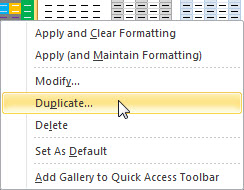
If you go to “Pivot Table Tools” in the ribbon and click on “design”, you will see a library of PivotTable styles on the left hand side.

If you duplicate an existing style, you can modify it.
You’ll find it has a “convenient” list of elements…but what each item actually controls is not intuitive or friendly, at least not to this Excel guru wannabe.
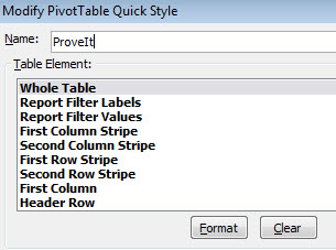
Add the fact that your settings for layout and style options can render certain style elements irrelevant, and the whole thing is beyond iritating. I’ve included a couple of screenshots below which give you an idea how the workbook can help you sort this out.


One thing which drove me crazy for a long time was where the very first value “whole table” gets its font information. You can’t change the text size of the stupid thing from inside the pivot table style – the whole pivot table will have the font you have set for “Normal” in your cell styles library. You can override the text size for some portions of the pivot table, but if you’re refreshing from a database, it often reverts the text back to the default.
Another “gotcha” is that it all matters how you have the pivot table laid out. Don’t anger the pivot table, don’t tease the pivot table, and for the love of pete, be prepared to ctl+z the heck out of the thing when you’re trying to get the layout to like you.
So without further ado, here’s the spreadsheet with the built-in PivotTable Style that looks like the inside of a circus tent for kindergardeners. It with either give you great insight, or it will make you go blind.

Thanks for putting this together….. I agree completely that this is a nightmare. Also hard to find info on the web that lays out what each element controls.
Thank you so much for this info. This is extremely helpful.
This is so handy. I have been battling with these styles for ages. Very smart to put a color to each style element.
you are glorious… thanks for this!
Thanks mate. Greatly appreciate the tip re: font sizing, that was frustrating me a lot!
Thanks for making this beautiful legend! 🙂 Pivot Table formatting has annoyed me for years. My strategy has been to just use the “None” design and avoid the headache altogether.
Oh, you want to format your Pivot Table AND use the compact outline layout? Nope!
Cheers Man !!
Great Help!!
Thank you so much for posting this! I’ve been looking for this forever.
I’m having a weird problem with a custom style and am hoping you (or someone else) can help. In my custom style, the first and second column stripes are two columns wide. I then set the Grand Total Row to be shaded with bold white font. But only some of the cells changed color: The title “Grand Total”, the second grand total value, and the fourth grand total value. The first, third, fifth, and sixth grand total values are shaded and bold, but still have black font.
I’m totally puzzled. Any clue?
Thank you so much!
Thank you thank you thank you!!!!
Absolutely fantastic information. Other sites just gloss over the information (especially MS themselves)
Thank you, thank you, a million times THANK YOU!!! I have been meaning to do the same for a very long time. May the Excel gods shower you with great blessings!!
Thank you! That’s EXACTLY what I was looking for!!
Thank you! I agree I don’t understand why Microsoft can’t spend money on technical writers to document their software. Your cheat sheet is very helpful!
You are wonderful for posting all this. I’ve had so such trouble figuring out formatting from just the element labels.
Exactly what I was looking for and couldn’t find anywhere else! Thanks for taking the time to do it and for sharing it!
This is exactly what I was looking for. Thanks so much for sharing this. Much appreciated.
I bow my head to you sir! Well done!
Thanks for reading, I appreciate the feedback. One small point, I am not a sir. 🙂
Amazing! Thank you
I totally agree how AWESOME this is — I’ve tried to do something similar myself several times and always give up after frustrated a whole day has gone by with NOTHING accomplished! Next challenge is to do a grid of what works right and what doesn’t between the tabular, outline normal, and outline compact options for each field. I get some stupid extra stripes unless I add a zillion rows using the outline compact option for every single row element!! 😦
Thank you for taking the time to do this!!! It is AWESOME!
Many thanks from another Excel guru wannabe!
Thank you! Some of the items don’t make sense by their description and when I change them they do something different than what I anticipate. This is beyond helpful, ma’am. 😀